
Why Every Trade Site Needs a Click-to-Call Button
A number in the header isn't enough. Here's where the button goes, how to make it actually dial, and what happens when nobody answers.
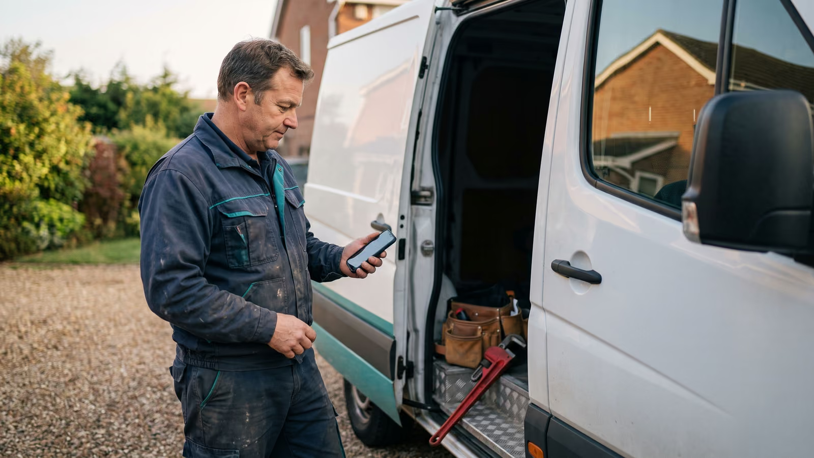
Someone standing in a wet basement with a phone in one hand doesn't read your About page. They want to talk to a person, now. So they scroll, hunting for a number, and if they don't find one in a second or two they go back to the search results and tap the next company.
That's the whole case for a click-to-call button on a contractor website. The call is the booking. Everything else on the page is there to get the customer to that tap.
Most trade sites get it half right. There's a number in the header on the home page, and nowhere else, and it's often an image, so tapping it does nothing.
By the end of this page you'll know where the button belongs, how to make it actually dial, and what has to happen when nobody picks up.
The conversion rate that matters is how fast someone can call
A contact form is a maybe. A phone call is a job on the schedule.
When somebody's water heater is leaking into the garage, they are not typing their name, email, and a description of the problem into four boxes and waiting. They tap a number. If the person on the other end picks up and can say "we can be there Thursday morning," the job is booked before the customer ever looks at another company.
That's why the conversion rate of a contractor website has almost nothing to do with how the site looks. It has to do with how fast a stranger on a phone can get a human on the line. Clean photos and a nice color scheme are worth having. What moves someone from reading to calling is something else.
Here's a test you can run this week. Open your own site on your phone, the way a customer would. Search your trade and your town, tap your listing, and time how long it takes to start a call. Do it on a service page, not the home page. If it takes more than a second or two, or if you have to pinch-zoom to read the number, you've found real money sitting on the table.
Design polish is cheap to fix later. A call you never got is gone.
Put the call button on every page, not just the home page header
Most people never see your home page. They search "furnace not blowing hot air" plus a town name, and they land on a service page or a city page. That page is the whole site to them. If the only visible way to call lives in the home page header, they're reading a page with no way out except the back button.
So the call button goes everywhere. Every service page. Every one of your service area pages. The about page, the financing page, the page about your maintenance plan. Anywhere a stranger can land from search or from an ad, the number should be one tap away without scrolling back up.
Put one in the footer too. Someone who reads an entire page about drain cleaning and reaches the bottom has already decided. Make the last thing they see a tappable number, not a copyright line and a list of links back to the home page.
A good habit: pull up your ad reports and your search console data, list the top ten pages people actually land on, and open each one on your phone. Those ten pages are where the calls come from. Most contractor websites have a tidy header and nothing else. The number appears once, at the top, then disappears the moment the visitor scrolls.
One number, repeated in the same spot on every page, beats a clever design that hides it. Repetition is the point here. Put the number in front of people more than once.
On a phone, make it a sticky bar, not a button in the header
Someone standing in a flooded basement is not scrolling back to the top of your page to find a number. They're holding the phone in one hand and a towel in the other.
A sticky call button solves that. It's a bar pinned to the bottom of the screen that stays put while the page scrolls, usually full width, with the word "Call" and your number on it. Wherever the visitor is on the page, the call is one tap away.
Put it on mobile only. On a desktop the header stays visible and a bar across the bottom just gets in the way.
Keep it plain. One action, your phone number, high contrast, big enough to hit with a thumb. If you want a second option, a small "Text us" next to it is fine. Two choices is the limit.
Test it yourself this week. Open your busiest service page on your own phone, scroll to the middle, and see if you can call your shop without thinking about it. If you can't, neither can they.
Use a real tel: link, not a picture of a phone number
A lot of trade sites show the number in a logo image or a graphic banner at the top. It looks fine on a desktop. On a phone it's a dead end. The visitor has to read it, remember it, leave your site, open the keypad and type it in. Some will. Most close the tab.
A tel: link is the fix. It's an ordinary link, except instead of pointing at a page it points at a phone number. The code looks like this:
<a href="tel:+15551234567">Call (555) 123-4567</a>
Tap it on a phone and the dialer opens with your number already in it. One tap to call. On a desktop it usually hands off to whatever calling app the person has, or does nothing at all. That's fine. Desktop visitors read the number off the screen.
Three things to get right:
- Use the full number with the country code and no spaces in the
href.tel:+15551234567works everywhere. The text people see can stay formatted however you like. - Make the visible text the number itself, or the word "Call" next to it. Click-to-call works best when people know what will happen before they tap.
- Never put the number only in an image. Search engines can't read it, screen readers can't read it, and nobody can tap it.
Most site builders will do this for you. Highlight the number in a text block, hit the link button, and choose the phone option if there is one. If there isn't, paste tel:+15551234567 into the URL field by hand. For the sticky bar on mobile you'll usually add a small widget or paste an embed into the site-wide code area so it shows up on every page at once.
Adding a tel: link in WordPress, Squarespace, or GoDaddy
In WordPress, open the page in the block editor, highlight the number in a paragraph or button block, click the link icon, and type tel:+15551234567 with your own digits. The editor will keep it as typed. For a button, the link field is in the block settings on the right.
Squarespace works the same way. Highlight the text, hit the link button, choose the external link option, and paste the tel: link in. Button blocks have a URL field that accepts it too.
GoDaddy's website builder sometimes hides the option behind a "Link to" dropdown. Pick "Web address" and paste the whole thing, tel: prefix included.
The format that gives the fewest problems is the plus sign, the country code, then the digits with no spaces, dashes or parentheses. Same rule across WordPress/Wix/Shopify platforms and the rest.
Then test it. Pull the live page up on an iPhone and on an Android phone, tap the number, and check that the dialer opens with every digit correct. Do it on a service page and a service area page, not only the home page. A typo in one link is easy to miss and costs you calls quietly.
A click-to-call button with no answer is a lost job
A tap that rings out and goes to voicemail looks the same to the customer as a site with no number on it at all. Worse, actually. They did the work, they reached for the phone, and nobody picked up. Most people skip the voicemail. They go back to the search results and tap the next contractor.
So the call button is half the job. The other half is what happens in the minute after nobody answers.
Our first automation on any trade site handles that: when a call from the site goes unanswered, a text goes back to that number automatically. The customer gets something instead of silence. You get a thread you can pick up when you're off the ladder, with the number already saved.
We keep a person in the loop on purpose. The text back is automatic. The automation stops and hands off to you or the office the moment the answer needs judgment: pricing, scheduling around a crew that's already booked, anything a real conversation decides. No robot quoting a job it can't see.
The click-to-call link is what gets the lead to raise their hand. The text back is what keeps them from walking while you're under a house.
Business hours are when calls are most likely to be missed
Business hours on a trade site usually means the crew is deepest in work. Hands in a panel. Head in a crawlspace. Gloves on, phone in the truck, three bars of signal at best. The call that comes in at 10:40 on a Tuesday is the one least likely to get answered, and it's coming from a customer who has a problem right now and your competitor's number one search result away.
So the question worth asking is not whether you'll miss calls. You will. The question is what happens in the ten minutes after.
Decide who owns the phone during the day. If it's the office manager, say so out loud and make sure every call from the site rings there first. If it's you, accept that you'll be late to half of them and set the recovery path up accordingly. Either way, something has to go out while the caller still has their phone in their hand.
Then keep the handoff honest. Automatic replies are good at acknowledging, confirming a number, and asking what broke. They're bad at anything that takes judgment: what a repair will run, whether you can get there today, how to handle a customer who's already unhappy. Those should land with a person, with the thread intact so nobody repeats themselves.
See every missed call and form submission in one place
Most owners guess at this. They know the phone rang a lot last week. They know a few people never got called back. They couldn't name one of them.
You should be able to open something once a day and see a list: who called, when, whether anyone picked up, and what happened after. Basic call tracking gets you the first half of that — the number, the time, the length. A call that lasted four seconds is a missed call, no matter what the log says. Pair it with the text that went out and the reply that came back, and now you have the whole thread.
Do the same for form submissions. A form that lands in an inbox nobody opens until Friday is the same lost job as a ringing phone in an empty office.
Start this week by pulling your call log and marking every inbound call under about fifteen seconds. That's your list. If nobody on your crew can say what happened to each one, that's the gap worth fixing first.
If you want help closing it, book a New Project Consultation.
Common questions about click-to-call buttons
Does a tel: link do anything on a desktop? It depends on the computer. Some open a calling app, some do nothing. That's why the number should also sit on the page as plain, selectable text. A desktop visitor copies it and dials from their phone. Nothing breaks either way.
Will I get more junk calls? You'll get more calls. Some of them won't be jobs, and that's the trade. A caller who taps once from a service page is usually looking at the exact work you do in the exact town you cover, so the mix is better than people expect. If the volume gets heavy, the office screens it the same way it screens the ones that come in now.
What if I can't answer during the day? Then the click-to-call button on your contractor website is doing its job and the recovery path isn't. The call comes in, nobody picks up, and a text goes back on its own so the customer knows they were heard. You pick it up when you're off the ladder. A button with no answer behind it just makes the miss happen faster.
If you'd like a look at how your site and your missed calls fit together, book a New Project Consultation.

About the author
Chris Hobbick
I build and fix websites, Shopify stores and business software. I work directly with business owners to understand the problem and agree on the work and price.
Meet Chris →Keep Reading
More Practical Reading.
Real articles on business systems, websites and automation.